adap+
brand design / packaging design
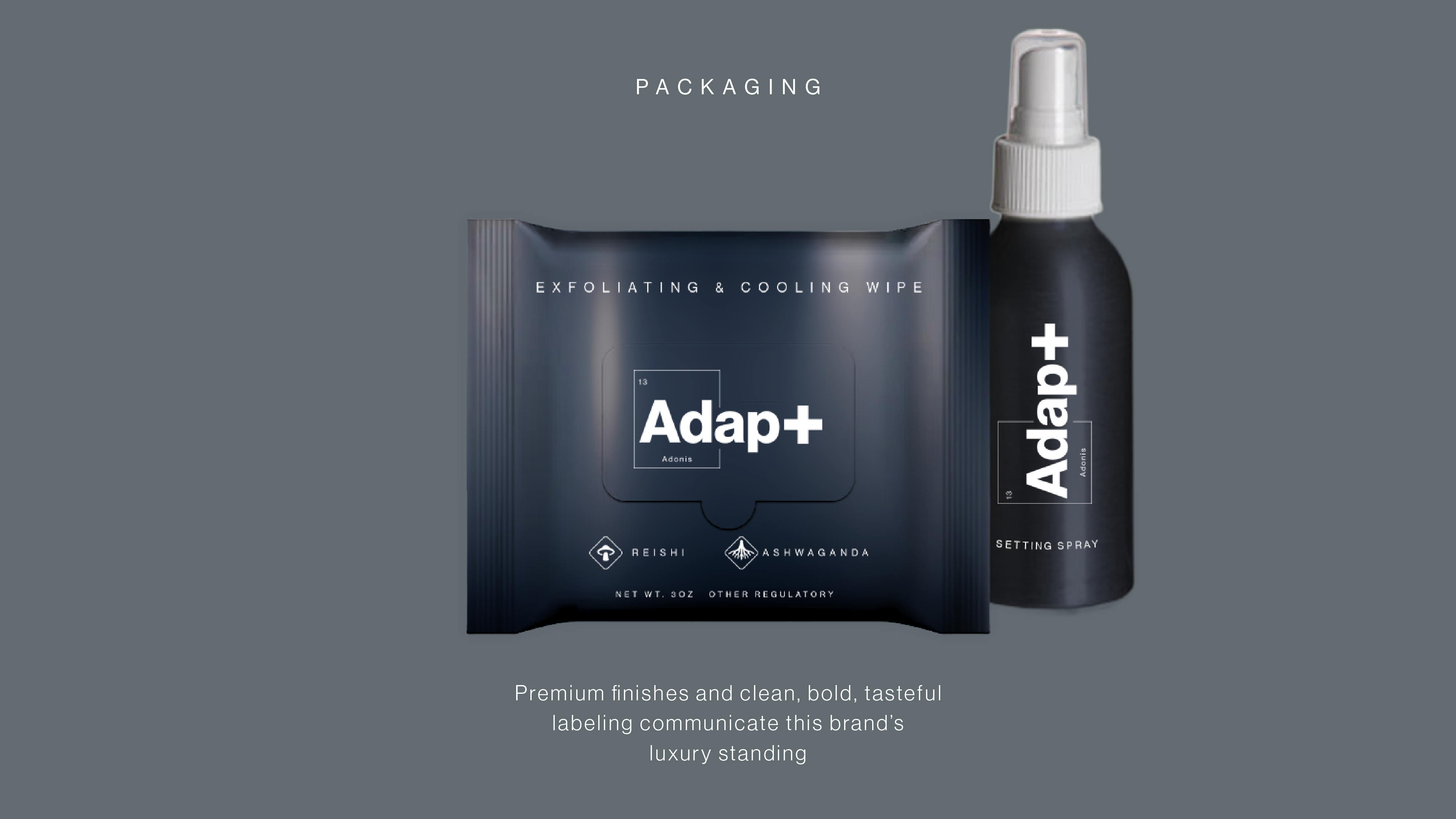
Premium skincare brand inspired by scientific imagery. Work includes file prep for packaging and manufacturing.
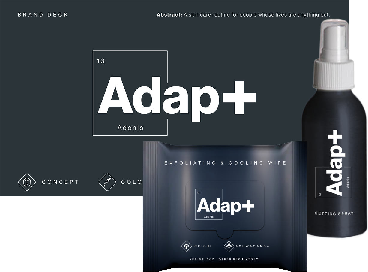
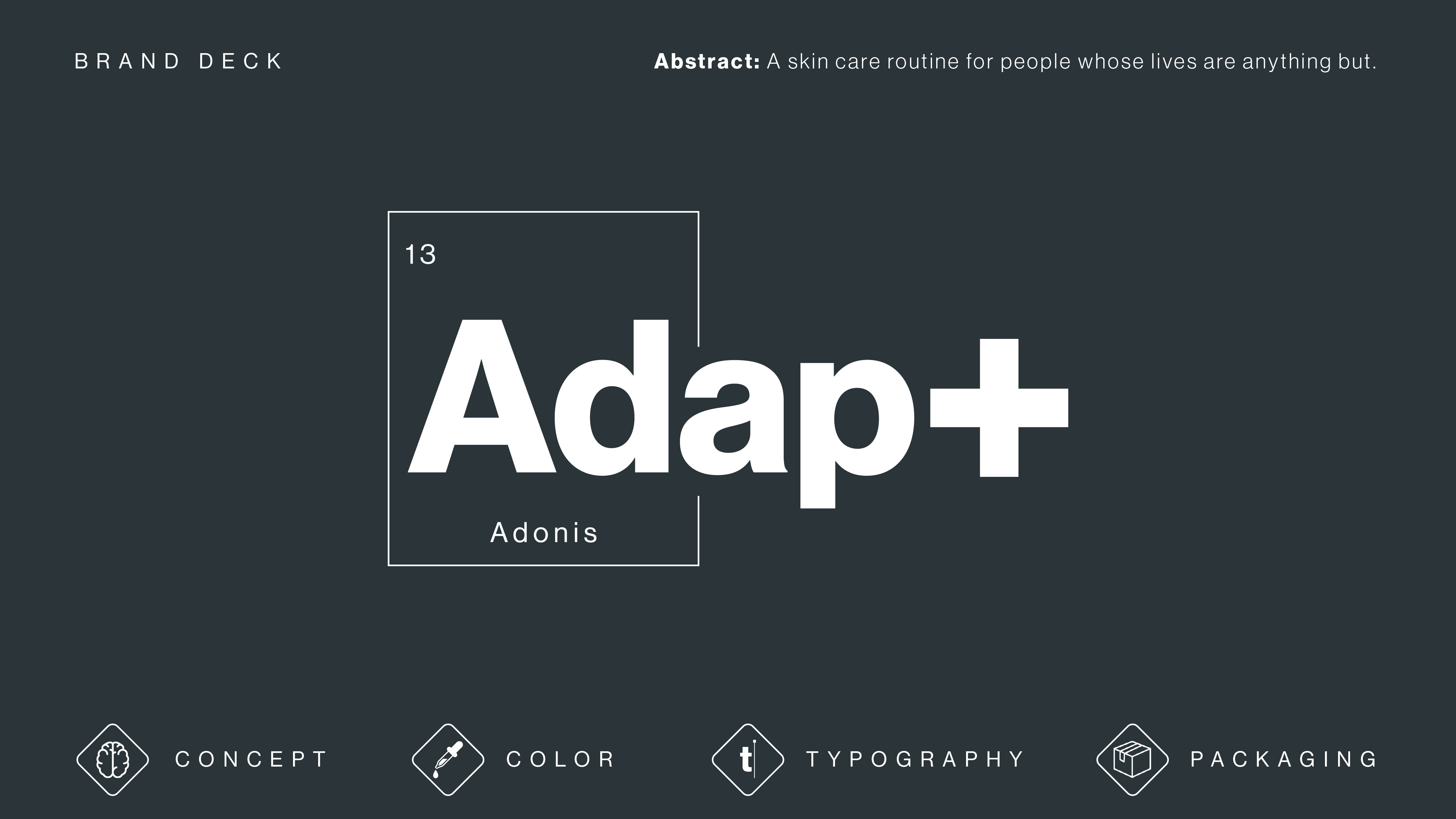
Adap+ is a luxury cosmetics brand with three verticals: Adonis (men), Aphrodite (women), and '+' (a line designed for gender-expansive people). These words together form the brand name.
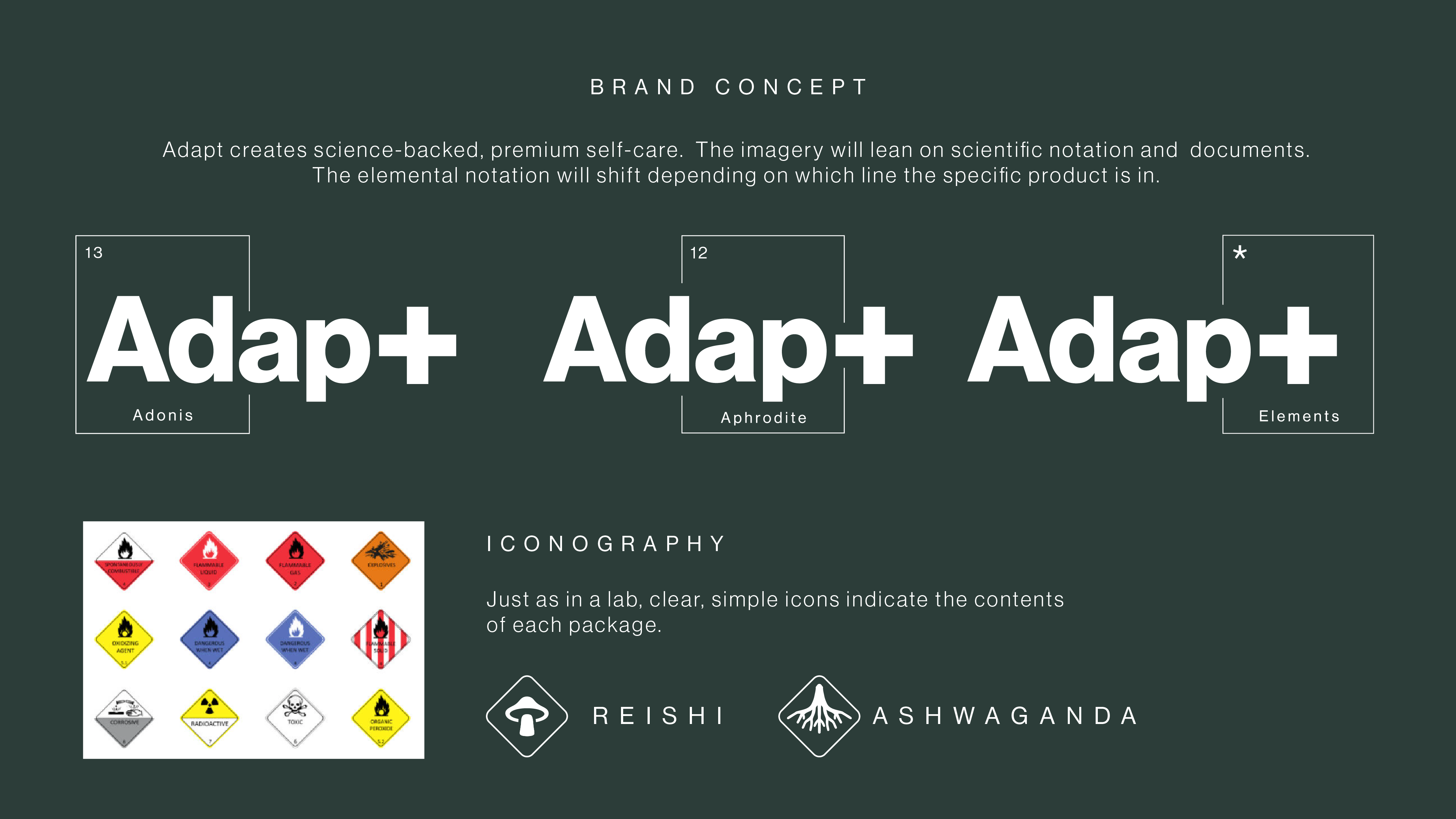
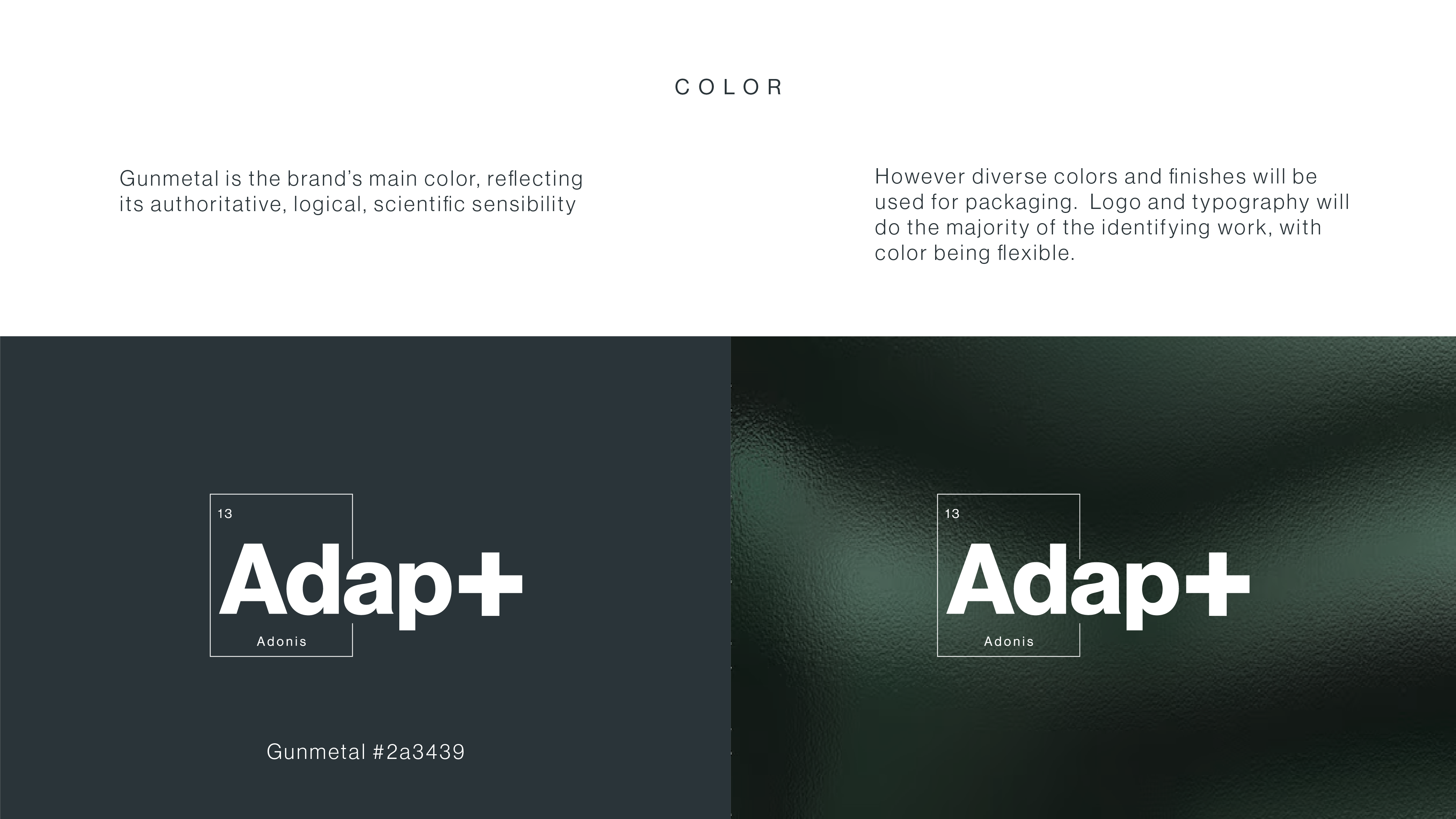
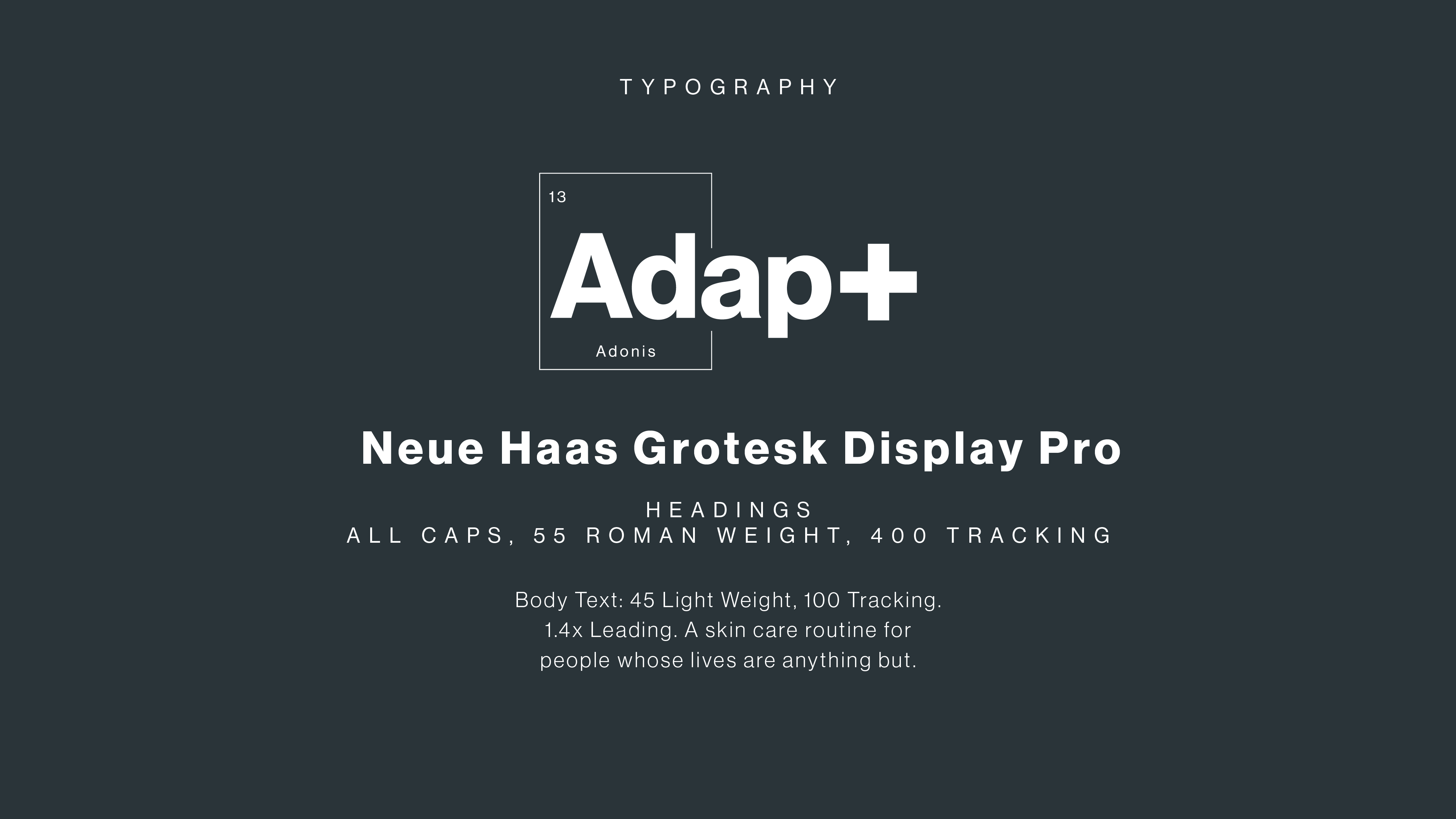
The framing component, modeled after the periodic table of elements, shifts depending on which vertical the related product is a part of. The client's original concept had the brand name stylized as AdAp+, but with the plus sign already presenting some ambiguity, I opted to maintain title case and add an element to differentiate the pieces of the brand name. This maintains readability and also ties the logo back into the overall scientific brand image.